Mon Jul 23 2018 2 min read
Quickly implement backdrop with flutter
Implement Backrop component from Material Design Guideline in Flutter.
I recently got introduced to flutter and its implementation of material design. After going through some sample implementation on the internet I discovered the Backdrop component from material design guidelines. I found it to be a very useful UI element with many use-cases. Sadly, there isn’t a backdrop widget in the official material package.
Hence, I decided to implement this component and published it as a package with supporting widgets. This post demonstrates how to use the package and its widgets to implement a basic backdrop component with flutter.
BackdropScaffold
Anyone familiar with flutter will be aware of the magical Scaffold widget which builds the basic app structure for you. Similarly BackdropScaffold widget of the backdrop package builds the layout for you with a given body and backlayer.

Add backdrop as dependecy
Add this to your package’s pubspec.yaml file:
dependencies: backdrop: ">=0.0.0 <0.1.0"Install package from command line:
$ flutter packages getImport backdrop in your Dart code:
import 'package:backdrop/backdrop.dart';Implementation example
First, lets see what arguments can be passed to theBackdropScaffold widget within the backdrop package.
title- (default=null) title for appbarbackpanel- (default=null) widget to be displayed in backlayerbody- (default=null) widget to be displayed in frontlayeractions- (default=null) list of widgets for appbarheaderHeight- (default=32.0) height of frontlayer to be visible when backlayer is activecontroller- (default=initialised internally) AnimationController object can be optionally passed from outside the widget
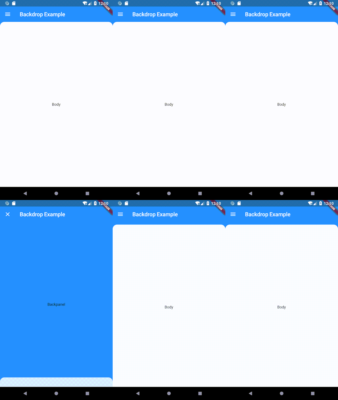
Finally, lets write down basic example for the backdrop using this widget.
import 'package:backdrop/backdrop.dart';import 'package:flutter/material.dart';
void main() => runApp(new MyApp());
class MyApp extends StatelessWidget {  @override  Widget build(BuildContext context) {    return new MaterialApp(      title: 'Backdrop Demo',      home: _BackdropScaffold(        title: Text("Backdrop Example"),        backpanel: Center(          child: Text("Backpanel"),        ),        body: Center(          child: Text("Body"),        ),_      ),    );  }}
That’s it!! BackdropScaffold makes it really easy for you.
Contribute
If you found this interesting. I request you to go through the git repo for contributing, giving feedback or just to play around. The package is still under active development and a lot of new features are to be implemented.